
REDESIGNING A MOBILE APP

Opportunity: Medofi is a mobile app designed to streamline communication within hospital networks by organizing messages, to-dos, and files. Although 500 licenses were purchased at Jefferson Hospital in New Jersey, only about 45 were actively used. This presented an opportunity to understand why the app was underutilized and identify ways to make it more valuable for hospital staff.
Goal: My team and I needed to find out why users were not using this application then redesign it to make it essential to the users.

ORIGINAL MEDOFI APP


COMPETITIVE MATRIX
We analyzed Medofi and key competitors by two factors:
Target audience: general public vs. hospital-specific
Core function: communication-only vs. communication + productivity tools
insights
Medofi supports productivity + communication and is HIPAA-compliant.
Competitors that offer similar features aren't hospital-specific and lack HIPAA compliance.
Hospital-focused apps are typically communication-only and don’t include productivity tools.
INTERVIEWS
To understand Medofi’s real-world usage and broader hospital needs, we conducted:
3 interviews with current Medofi users at Jefferson Hospital
3 interviews with potential users from hospitals across New York
Participants represented multiple departments, giving us a cross-hospital perspective on communication, workflow, and daily pain points.
insights
Helps staff feel connected even when working apart.
Messaging feels redundant because it repeats what email already does.
HIPAA-secure messaging and file sharing are essential.
Other tools aren’t user-centered and feel unintuitive.
Medical tech is often outdated and frustrating to use.
“90% of what was in Medofi was already in my email!”

AFFINITY MAP
We synthesized our interview data using affinity mapping to uncover shared needs and recurring themes. These patterns guided the priorities for the Medofi redesign.
INSIGHTS
Staff want to spend more time with patients, not navigating software.
Patient information needs to be available immediately.
Hospitals need a reliable mass-communication system.
Teams are physically spread out but must coordinate care across departments.
HIPAA-secure messaging is essential.
Staff want tools that are intuitive, accessible, and modern.
Employees need instant access to hospital-wide alerts.
PERSONAS
Using insights from our affinity mapping, we created a primary and secondary persona to guide our thinking and keep the redesign aligned with user needs.
USABILITY TEST- ORIGINAL MEDOFI APP

We conducted four usability tests with medical professionals at NewYork-Presbyterian Hospital. Tasks were based on Medofi’s current features and the goals of our user personas, Patrice and Milton.
OUR FINDINGS
Users like color-coded message triage, but find the colors overwhelming.
A hospital directory is noticeably missing.
Users want private messaging.
Users want to delete their own comments.
The weather survey feels out of place on the homepage.
Users appreciate how customizable Medofi is.
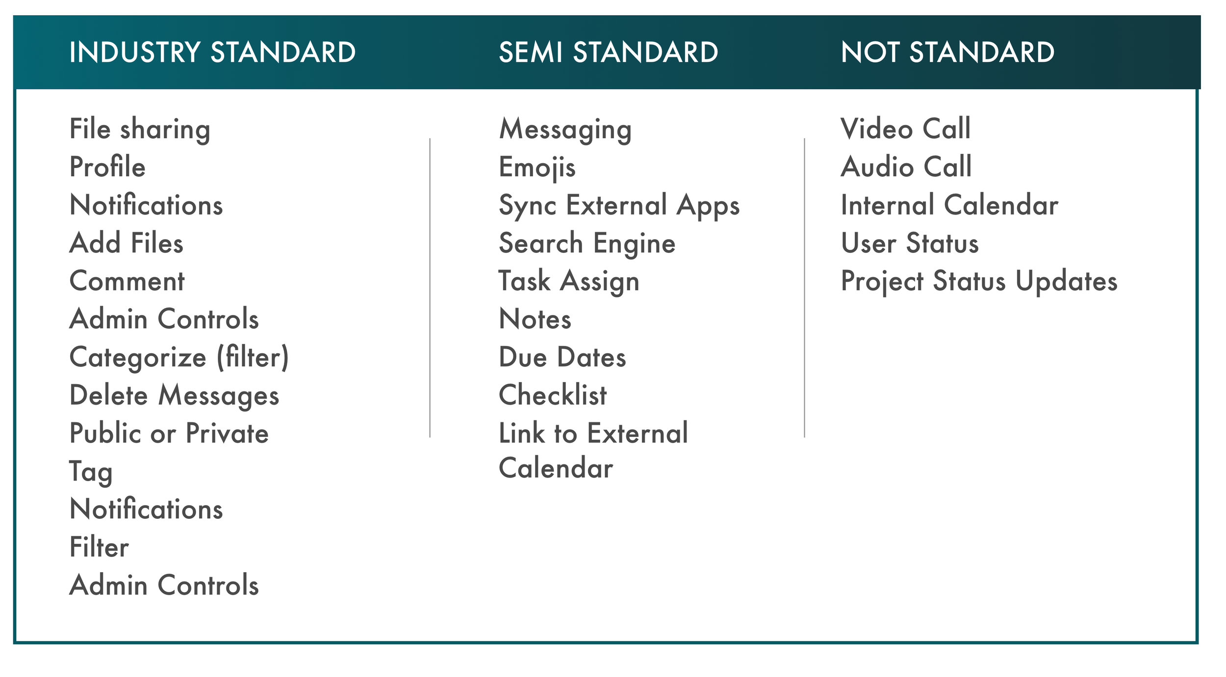
COMPETITIVE FEATURE ANALYSIS
We did a feature analysis of the competitor applications in the market to see which features are standard and users will expect.


COMPARATOR FEATURE ANALYSIS
We did a feature analysis of the current comparators in the market to explore their features as well as use of color and design. By understanding their innovative flows, we were able to see what their users expect and how they might navigate the application and apply these findings to MeDoFi.


FEATURE PRIORITIZATION & MOSCOW MATRIX
Overloading the app would create confusion and frustration, making it unusable. We prioritized features from our competitive and comparative analysis using a Must Have / Should Have / Could Have / Won’t Have framework. The features selected for the redesigned Medofi app are essential for users, HIPAA-compliant, and aligned with industry standards.
MID-FIDELITY WIREFRAMES

TASK FLOW
CURRENT MEDOFI APP VS PROPOSED REDESIGN
Proposed redesign requires less scrolling
User can find messages quickly and easily, resulting in less frustration
Reducing steps to view message details from 4 steps to 2 leads to a faster user work flow.
Clearer path to messages lets the user quickly acquire the important information they need and get back to work, which letting administration know their message has been read.
Simpler, quicker and direct paths to accomplishing tasks results in more efficient communication with less aggravation.
USER FLOW
PROPOSED REDeSIGN
User Needs:
One-to-one messaging
Easy, HIPAA-compliant file sharing
• File Sharing Paths:
Chat: attach file directly (younger staff prefer this)
Patient Files: find file first, then send (older staff prefer this)
Directory: find recipient first
• Design Highlights:
Patient-first filing system: select patient → file → recipient
Sender always sees: patient, file, recipient
Secure & HIPAA-compliant: files stay in Medofi and hospital database
ANNOTATED HI-FI WIREFRAMES


Usability Testing
We tested our hi-fidelity prototype at three NYC hospitals with staff from multiple departments. Participants completed the same three tasks from the original app, plus tasks for our new features.
Results:
Task completion times decreased significantly
Users were able to complete tasks directly and with ease

USER JOURNEY MAP
We mapped how Medofi fits into users’ daily workflow to identify opportunities for efficiency and collaboration.
INSIGHTS
Dr. Fogel’s mood improves as he continues to utilize MeDoFi during his shift because it enables him to spend more face-time with his patients and less time at a desk or doing administrative tasks.
INVISION PROTOYPE
NEXT STEPS

Moving forward, we would love to add on more features that users told us were important to them, such as group messaging/chat.
We would also like to redesign the desktop administration dashboard to be more intuitive and be correctly used my the Administrators.
Finally, we look forward to handing off our designs to the developers.
IN CONCLUSION
We know and trust that the new Medofi App will prove to be an essential tool for all hospital employees.
Our research and redesign will undoubtedly increase our client’s sales and make communication within hospitals more efficient and increase employee productivity.