Project Overview
The New York Historical Society is a library and museum that carries an extensive collection of historical artifacts and research materials, all of which are also available to view on their website.Their website is loaded with everything they have to offer, but too much content crammed into a space untimely will result in overcrowding, frustration and difficulty finding those fascinating artifacts that make the NYHS so esteemed.
My Role
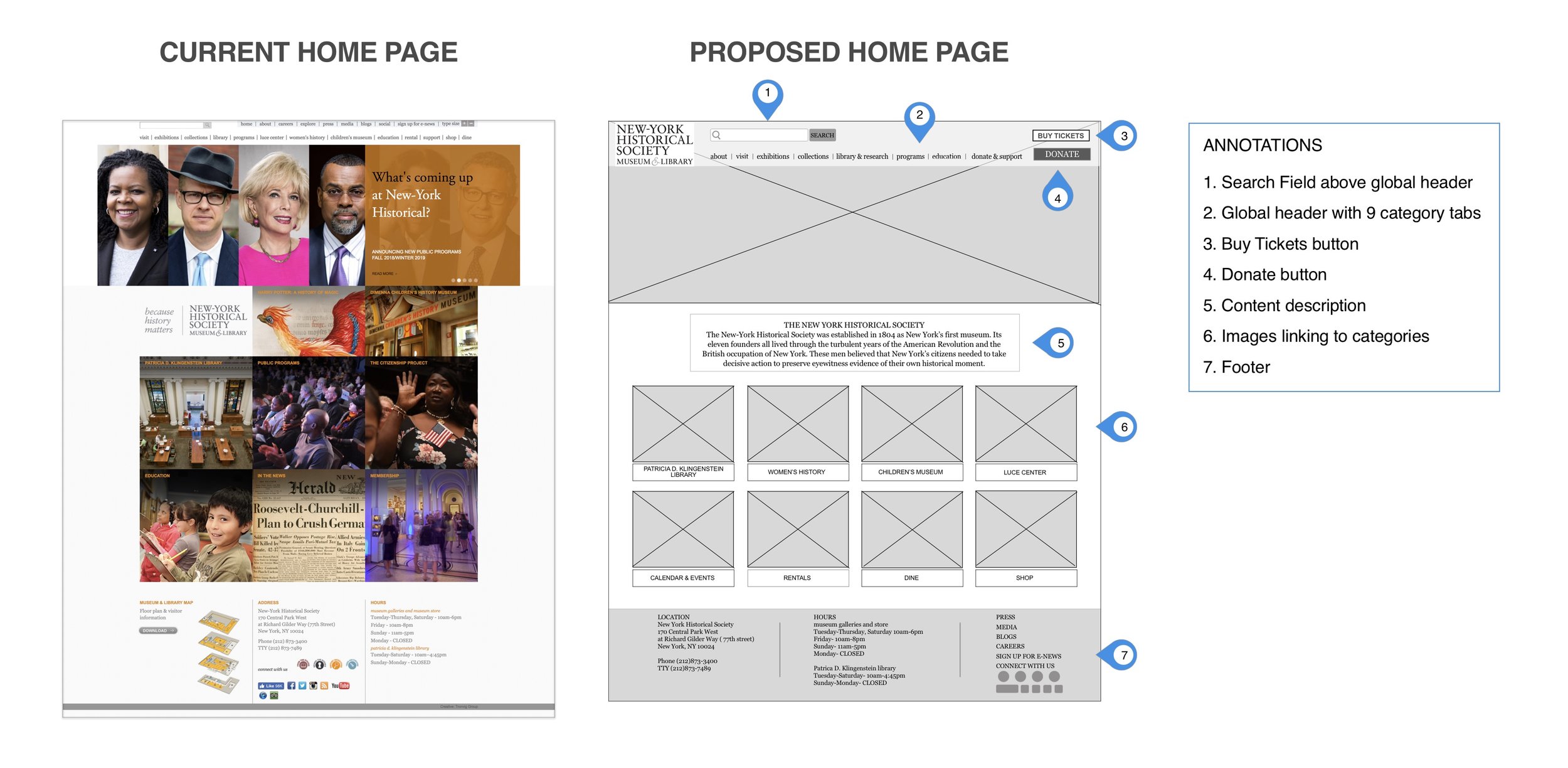
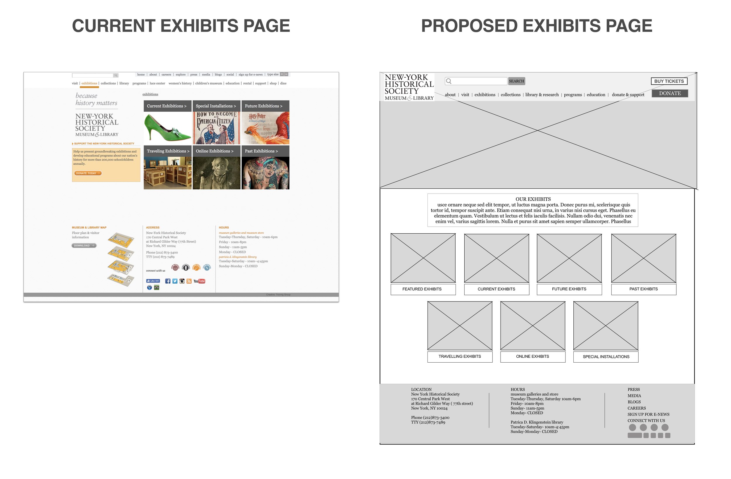
Re-organize the information architecture of the New York Historical Society’s website to make it easier for the users to navigate. I also needed to redesign the website, making less overwhelming for users to view.
BUSINESS MODEL CANVAS
To get a full picture of the New York Historic Society’s business model our team built a business model canvas.
OUR FINDINGS
Main sources of funding for the NYHS are donations/charitable contributions, memberships, event space rental, and admission fees.
The NYHS’s primary focus is the educational sector and providing resources and access to information.
Target audiences include children, students, parents, historians, and donors, and NYHS business model caters towards activities for those audiences.
COMPETITIVE MATRIX
We created a competitive Matrix to see where the NYHS fell in market amongst its competitors.
OUR FINDINGS
Many competitors in this space are within two opposite categories - “Broad and Academic" content vs. "Specific and Recreational".
The New York Historic Society is actually a closer competitor to libraries like New York Society Library and New York Public Library rather than more recreational museums like the Museum of Food or Sex.
Heuristic Analysis
We went through the current desktop & some mobile pages of the NYHS and scored them according to The Abby Method and her 10 IA criteria. Each of the 10 categories were broken down and given scores from 1 (worst) to 5 (best). We performed a heuristic analysis in order to evaluate the strength of what is currently offered to the users, aid our teams planning, design and development, and help us to predict effectiveness of potential solutions.
OUR FINDINGS
Though many of the pages that are offered have a high level of clarity, their extremely low level of accessibility keep users from reaching their goals.
Pages have a very low level associated with being findable. The site may contain the information however, it is extremely difficult to find.
In spite of the inability to reach the information, if the information is found, it has a high level of clarity and usefulness for the user.
USER TEST -ORIGINAL NYHS WEBSITE
After screening for potential users for the NY Historical Society’s website, we met up with 5 of those people and gave each of them the same 3 tasks to achieve using the current desktop website. We timed how long each task took as recorded everything they said and took note of their actions and reactions. We needed understand how each person approached the current website and how they navigated through it to complete tasks. By watching and timing them we were able to compare how long each person took to finish each task, the different paths they all took and how they appeared to feel while navigating.
OUR FINDINGS
TASK 1: Buy one student ticket to the museum.
“I felt stupid using this site.”
All participants seemed to expect a button to buy tickets to be right on the home page
All users hesitated before choosing a path - indicating too many choices from the homepage - users seem overwhelmed
TASK 2: Find the name of the FDR exhibit you saw last month.
“Overall, this was pretty easy.”
If users did not pick the exhibitions tab first, they often failed and felt lost for a while until they found the exhibitions tab
All users had some ease in finding the exhibitions tab, but did not immediately notice the secondary drop down.
TASK 3: Browse the website’s online resources for primary sources of research.
“This whole site is overwhelming.”
Some users found research databases through links that lead to external sites
5/5 users failed to find the digital collections database within the NYHS site.
CLOSED CARD SORTING
We dissected the main tab bar on the home page of the NY Historical Society's website and wrote each category and their content within on individual index cards. We then asked 5 different people to organize the content cards using the categories provided. We needed to get into the minds of our users and see what they expect the name of categories that hold certain information to be.
OUR FINDINGS
All of the content originally under “Women’s History” on the NY Historical Society’s website was found by testers to be more relevant in other categories.
Content under the “Library” category was found to be more relevant under “Collections”
Content that is under the “Luce Center” category was found not to be relevant by any users to the “Luce Center” tab.
OPEN CARD SORTING
We had 5 separate testers take the same content cards from our closed card sorting and removed the “categories” cards. Then we had the testers group the content cards together in a manner that they saw in their mind. Once they had placed and grouped all of the content cards together, the testers then wrote down their own “categories” and assigned them to their groupings. We did this so we can better get into the minds of our users and see what they expect the name of categories that hold certain information to be. This also leads us into what they are used to seeing on other websites that have similar content. This process helps us to see what content might not be important or of use to users based on which content cards were pushed aside.
OUR FINDINGS
Many created less categories than the current amount on the NY Historical Society’s current navigation bar.
More than half of our testers drew a clear distinction between “Library” and “Collections”, most testers completely separated all content into both groups.
2 out of 5 users removed more than 5 content cards from the test claiming that they were either redundant or unrelated to anything else on the site.
SITEMAP
This sitemap helps us to clearly see the entire structure and content of the NYHS website all at once without having to click or hover over anything to find hidden content. We can now easily see possible navigational paths without having to actually navigate through pages. The structure of the site is clearly laid out for us and makes it so much simpler to see where there is redundancy and where specific content lives
.OUR FINDINGS-CURRENT SITE
There is an exhausting list of content that the user has to search through in order to navigate through the site.
There is clear redundancy within the contents of the categories. Contents with the same label may or may not take you to the same place, so navigation is a bit of a guessing game
Some content actually has subcategories upon more sub categories, making content hidden and nearly impossible to find.
OUR FINDINGS-PROPOSED SITE
Reducing the categories in the global navigation from 13 down to 8 made it faster and easier for the user to find what they were looking for.
Content within the categories were reorganized and redistributed through the site. There are now 31 elements of content instead of 77.
Many items such as hours, location, social media have been moved to the footer.
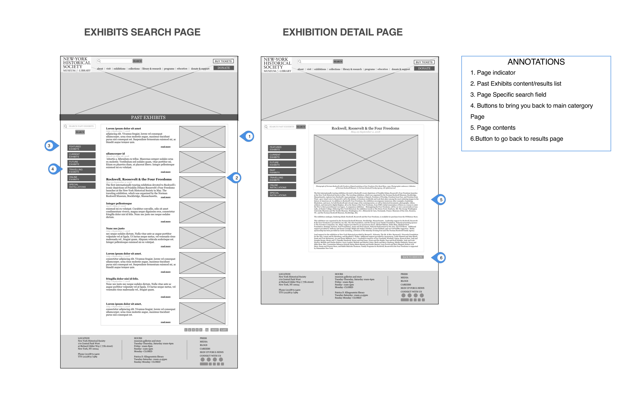
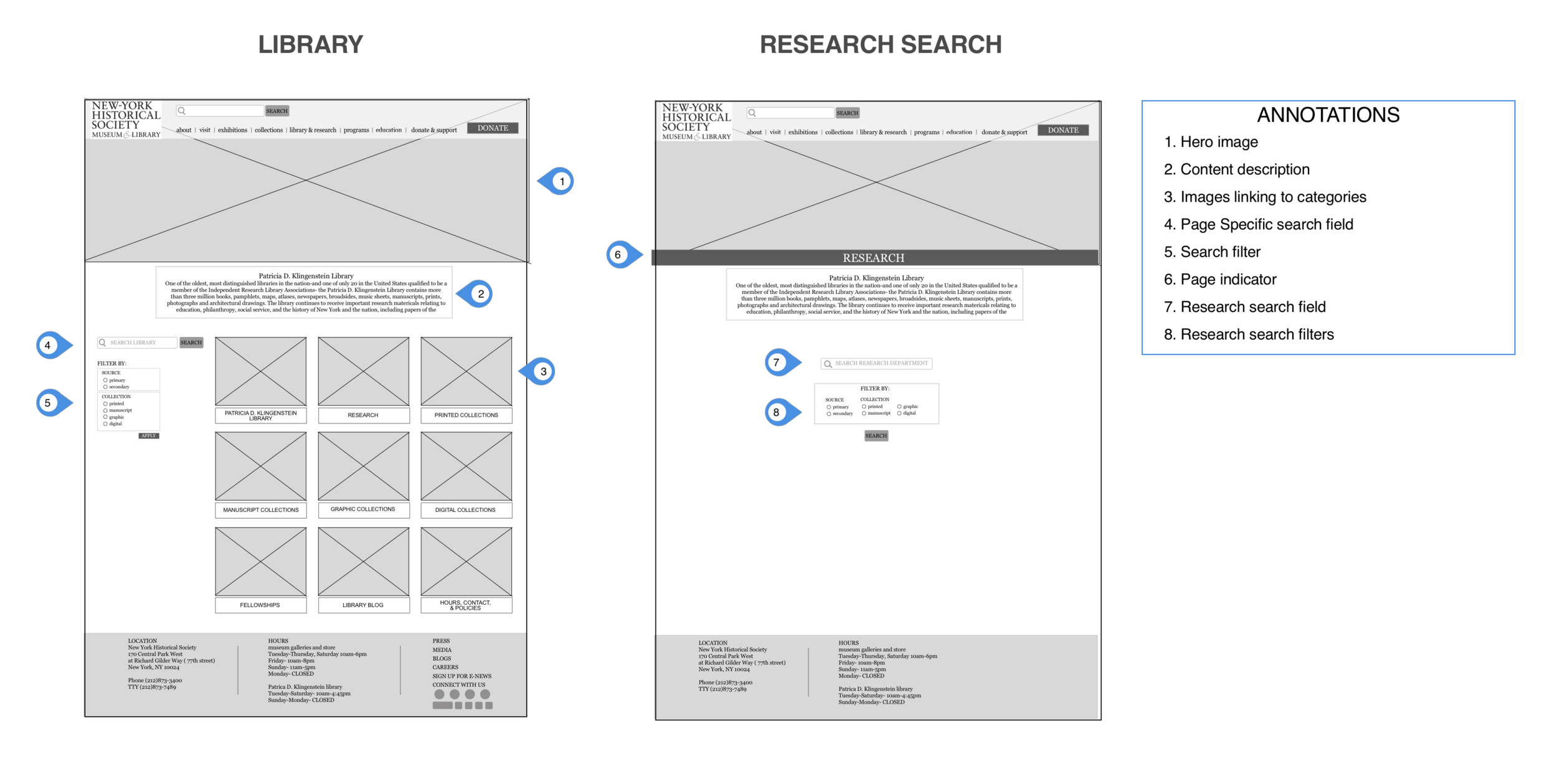
All of the subcategories and content have been relocated to content navigation and call or action buttons within different pages of the site making it quicker and easier for users to navigate and use the site without being overwhelmed by dropdown menus.
TASK FLOW
We created a task flow chart to show the step by step path that we expected our user to take in order to achieve a specific task using the NY Historical Society’s desktop website. The user was asked to start at the homepage and figure out how to browse the site’s online resources for primary research sources for their report on “The birth of an nation- the first few years after the revolutionary war”. We can visually see if there is a clear path and how many steps it takes to get there.
OUR FINDINGS
There is a path that does not require to many steps or hunting around on screens to figure out where to go next, eliminating guesswork as to- is this task even possible?
This path uses dropdown menus and search fields to achieve the user’s goal, hopefully making it easier to accomplish than searching the many categories on the home page
By seeing the path drawn drawn out, we were able to identify how many choices or hurdles, if any, that the user would have to tackle.
USER FLOW
We created a flow chart for the NY Historical Society’s desktop website showing all possible paths that users can take to finding primary resources for a research paper.. Through our usability tests, we learned that users for this site took many different approaches to completing the task. We needed to map out every possible way that a user might be able to use on the current NY Historical Society’s website to get from the homepage to their primary resource needed for their research. This lets us know how quick and simple, or how time consuming, complicated or frustrating it might be just to do this on task on the site.
OUR FINDINGS
While creating the task flow to find primary sources for research purposes, we discovered there are 3 more possible paths the user can take to achieve their goal.
There is clear redundancy within the contents of the categories. Contents with the same label may or may not take you to the same place, so navigation is a bit of a guessing game
While one path may have less actions to take, the ability to figure out the path or action may not be necessarily be easier due to congestion of content and other possible actions on the screen along the way.
ANNOTATED MID-FI WIREFRAMES


